Why I Love Making Maps - Part 1

Northumberland - England’s Border County - Print and Greetings Card
I didn’t set out to make maps, they crept up on me. Years ago when I was still experimenting with how to capture the north east landscape and what it means to me, my husband suggested having a go at a map of Northumberland. That map has proved very popular, and I have been asked to create new maps ever since.
I love making them, and have too much to say for one blog post, so there are two chapters. Here’s the first one…
Memories, Colour and Fun
A map can have so many reasons to exist, not all of them to do with roads and rivers. In this chapter I’d like to share some of my favourites - maps which were painted to bring back happy memories, a splash of colour, and a sense of place. All of these things are very important to me, and I think that’s why I enjoy making them so much..

The Armstrong Boggis Smith Story - Private Commission

The Armstrong Boggis Smith Story (detail with Chillingham Castle)

The Armstrong Boggis Smith Story (detail with Teesside)
My most recent commission, this map has so many people, places and stories it ended up huge! From Edinburgh down to Sheffield via London and the Netherlands, it documents the lives of a large Yorkshire-based family. I was sent lots of family photos and stories, and it was great fun to piece it all together. Geographically it’s as accurate as I can get it, and with a map like this the main consideration is that the important illustrations have the space they need. My favourite bits to paint were spooky Chillingham Castle and Teesside. In fact when I was adding the llama at Stewart Park I had flashbacks of being thrown into the lake there as a child by a group of teenage lads. Not a nice memory that one!

A Trip Along the Tyne - Private Commission

A Trip Along the Tyne (detail)
The Children’s Heart Unit Fund (CHUF) at the Newcastle Freeman Hospital asked me to paint a panoramic map of the River Tyne, from Newcastle out to the coast. The nurses suggested this as the walls in the parent/carers room were long and a fairly bleak. As you can imagine, a bit of colour and distraction was called for as well as a an idea of where we actually are in the country. Many of the patients and families are miles away from home.
I was very much left to my own devices with this project (the nurses have much more important work to be getting on with) so it was a relief when the map was greeted with lots of smiles and hugs. Having walked through the ward itself and seen the reality of the lives of the children and their families, it really felt quite emotional.
To raise funds, CHUF sell teddy bears wearing white t-shirts with red hearts on, so I included lots of them in the map. I hope that any children who see the map will have a bit of fun spotting them all…
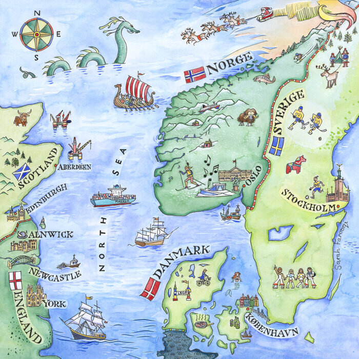
Scandinavia - Private Commission
One of my all time favourite maps, this was commissioned by an education/training company called Challenging Learning, to go in their brochure. They have offices in all of the countries shown, and the gentleman who commissioned it gave me a list of possible things to include. I particularly enjoyed painting Abba, the sea serpent and Santa flying through the Northern Lights!

Christmas in Northumberland - Christmas Card

Christmas in Northumberland (detail)
Continuing my Santa theme, it’s always fun to paint wintry/Christmassy maps, and I’ve done a few now. This is one of my favourites and it’s actually a Christmas card design. Sometimes I can add borders around the edge, and these can include many more illustrations as well as the lettering which I’m always drawn to. One of my top memories at primary school was finding out about illustrated manuscripts and getting to design my own. I wish I still had it…

The Lowther Castle Winter Visitor Map

The Big Lowther Bear Hunt - Children’s Trail Map
These two maps were commissioned by Lowther Castle. The first is their Winter map and the second is a trail map for one of their children’s events.
I enjoyed so many aspects of these maps, but one of them was being asked to work in black and white. I wasn’t sure at first but it’s actually very liberating just thinking about tones and textures rather than colour. I used black ink and pencil. It was also liberating being able to rub out the pencil when I felt like it! These maps gave me the opportunity to experiment with different lettering styles. I used the classic Garamond italic for the lettering on the winter map and then all kinds of mad lettering styles on the children’s map.

Tynemouth and Whitley Bay - Print and Greetings Card

Tynemouth and Whitley Bay (detail)
This map already illustrates a particular point in time, as the people who commissioned it (a fantastic gift shop called For the Love of the North) have since moved from their first shop in Whitley Bay to new premises at Spanish City. They asked me to include all their favourite places, and also the character Vera from the Ann Cleeves books, as she was being filmed solving crimes on the headland just near Whitley Bay beach.
This print/card is available from their website and in their shop at Spanish City. It’s also available from my website.
You’ve probably seen enough maps for now, but thanks for reading, and watch out for part 2!