Everest England Book Illustrations
Project Background
Peter Owen Jones was writing a book. Written in his uniquely spiritual prose, it describes his journey up some of the most well-loved hills and mountains in England. These ascents add up to the same height as Mount Everest - hence the title.
I had a call from the AA Publishing Group, asking if I could make some very simple black and white line maps to illustrate each walk. This was very appealing. I liked the sound of the book, the publishers were lovely (we collaborated on the phone as they are based down south) and working with a celebrity vicar and countryman was going to be fun!
The Challenges
Challenges soon presented themselves. Firstly, the descriptions of each walk hadn’t been finalised and yet the deadline was fast approaching. I couldn’t travel round the country and do each one (unfortunately) so I had to work with what I had. And the best I had for each map was this:

OS maps. There was much debate on the features for this particular route, mainly involving radio masts…
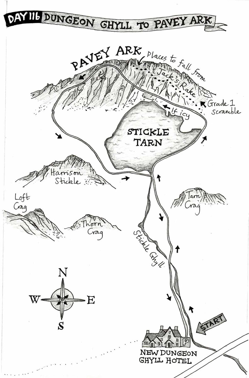
I did have a little panic that someone might use my maps to climb up Pavey Ark and end up falling off the edge (which I’m told is very easily done), but I was assured that the text would make it clear that the illustrations weren’t for navigational purposes. Phew!!
The second challenge was communication. I’d only recently moved in to my studio at Felton and the phone line was patchy. Also, Peter was out a lot, walking and looking after his congregation, so the publisher had to be patient with us both!
The next challenge was agreeing on a style for the maps. I sent 3 different versions to the art editor:

A. Pencil only

B. Ink and watercolour

C. Ink only
Here’s where it got tricky. Whilst I liked B, the art editor liked A, and guess which one the author preferred… But the publisher felt strongly that the simple bold lines in C would do the trick, and now I’ve seen the book I think he made a good decision. Peter was less convinced as he felt the illustrations should be much wilder less polished, as though he had sketched them himself whilst out in the hills. I understood where he was coming from and I did try a couple of other ideas but they just wouldn’t have reproduced well enough.
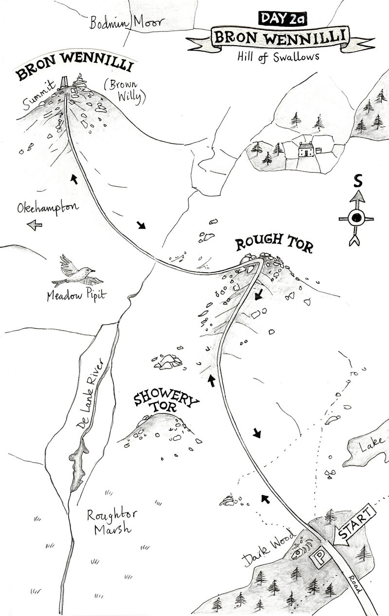
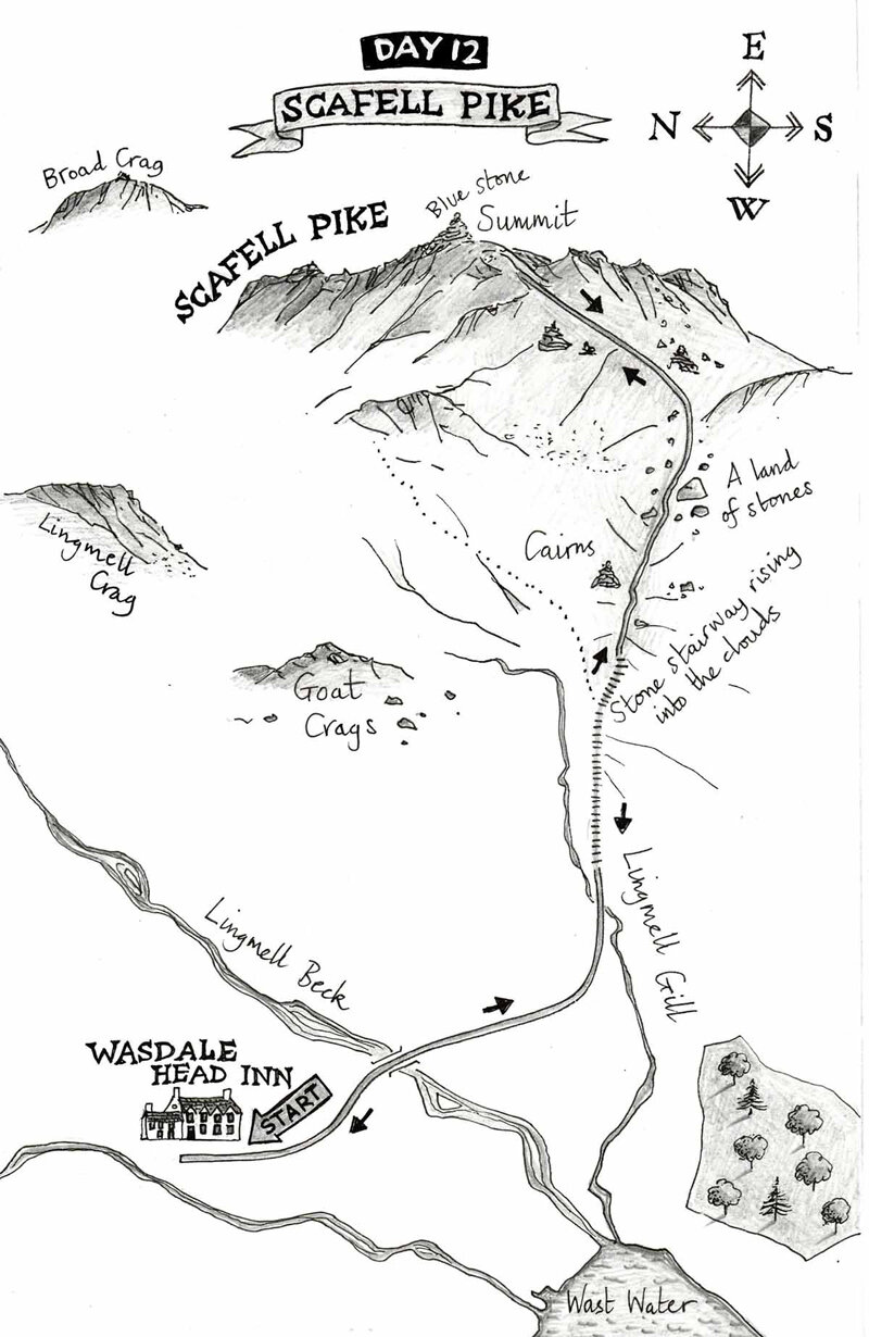
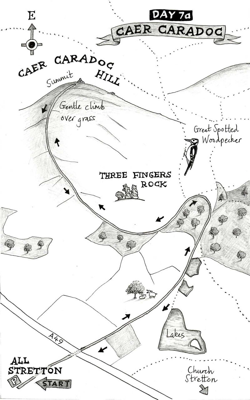
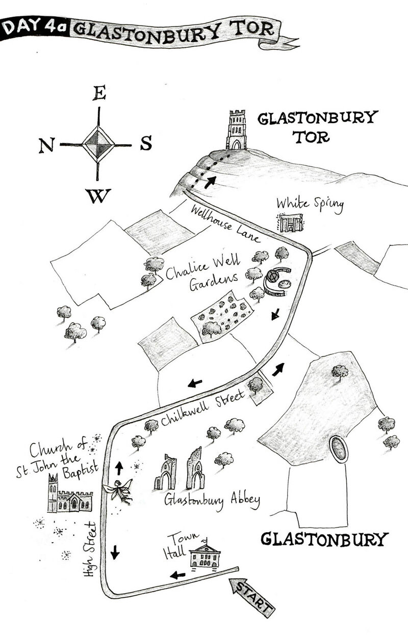
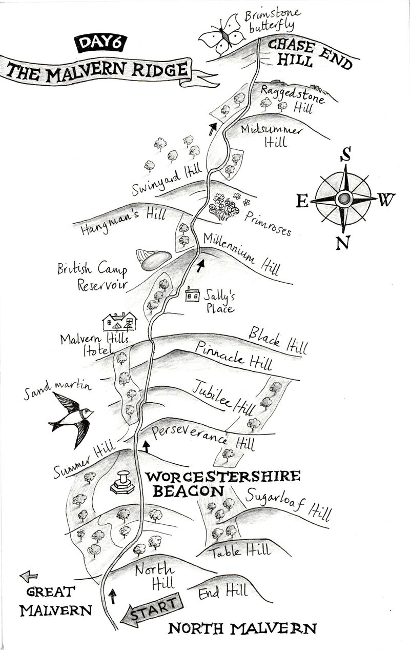
Here are some of the finished illustrations:
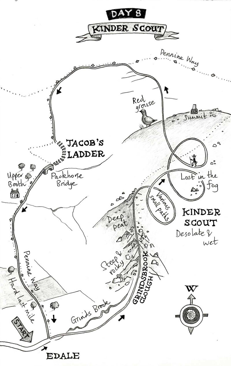
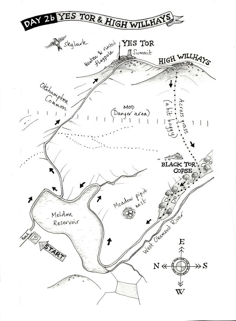
Can you spot the author lost in the fog on Kinder Scout?!
How the Book turned out
The book looks really nice. It’s for sale on Amazon and has some great reviews, and I love the way the photographs and illustrations have been printed.


This is one of the projects I’m most proud of. It was a challenge, and I love a challenge. It taught me about working successfully with people I’ve never met and who don’t necessarily agree on everything. I learned that that’s actually fine, as we all wanted the best for this little book…