Painting Sunrise over Low Newton
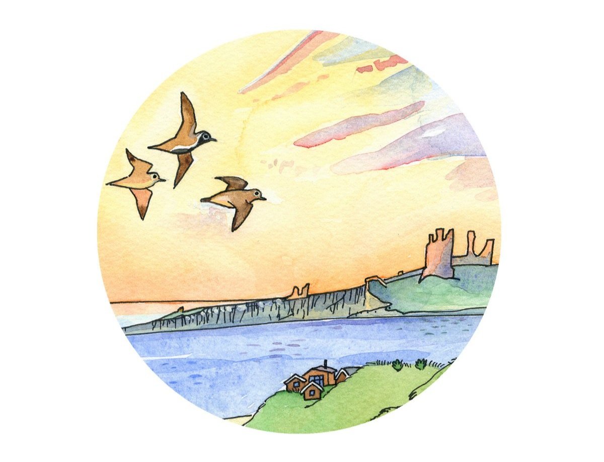
Some of my favourite ever days have been spent here, and I’ve always known how I’d like to paint it - with warm, nostalgic colours and a sense of peace. As the beach faces east, a sunrise seemed perfect.
I’d like to talk you through some of my ideas about making pictures and how these relate to my new painting.
Thoughts on drawing

You would be surprised at how much time I spend looking at things before and during painting them. Art tutors will tell you that drawing is more about looking than it is about mark-making, and I couldn’t agree more. Probably for every mark I put down on paper, I’ll look at my reference sketches and photos five times. Every line and blob needs to be authentic and to add to the story - if not then it shouldn’t be there. That’s how I create the simplicity and economy I need in order to cram in all the detail! That’s also why each painting takes me so long.
Making the first marks on a piece of paper can be terrifying. People often tell me that the thought of getting started actually puts them off trying to make art, and I can relate to this. I always begin with lots of picture research, including my own photographs, other photographs and also other artists’ interpretations. For this picture I also looked at lots of sunrises, to figure out how the colours and reflections might work in my own painting.
During all of this looking and thinking, a composition usually starts to form in my head, and I’ll make a very rough sketch, followed by a more detailed pencil drawing.
Drawing buildings and streets requires a bit of technical care. I want my pictures to be easy-going, but not to jar, and so I do need to think about perspective and distance. This can be a process of trial and error, and a rubber comes in very handy. I remember my time drawing bits of sewing machines and old cameras at art college, and the basics of technical drawing often come back to help me.
Then, there’s the journey your eye takes as it looks at the picture. I try to think of this as a story, with definite stages. Sometimes it’s as simple as foreground, middle ground and background. Sometimes you might need to make sure that the right part is given centre stage, and that it isn’t fighting with something else less important.
There are some simple rules which can help too - the rule of thirds is handy. If you place things centrally, it can split a composition in half, and this can look awkward. I imagine my paper is split into thirds, both vertically and horizontally. This way, anything dominant goes either to the left or right of centre, and above or below the middle.
Here’s the pencil drawing…

I spent a bit of time making sure my drawing created a sense of that sweep down the hill and into the village. The perspective needed to be accurate, but the dunes, the beach huts and the castle provided me with plenty of higgledy-piggledy elements to soften the composition.
Thoughts on painting

This is always my favourite part. I aim for a contrast between precise details (eg. the poppies, birds, castle etc.) and large areas of wash, where I can let the paint do its own thing (eg. the sky and the water). You might think the “washy” areas would be the easiest bits but in reality the lack of control over what the paint is doing can be challenging, especially when you have an idea about what effect you want to create. Watercolours tend not to cooperate with such ideas! The flip-side is that you can stumble into some beautiful colour combinations and effects, totally by accident.
Colour is often dictated by the subject matter, but it is so subjective and I know from frequent arguments within my household that everyone sees colour differently. I try not to think too deeply about it, and to go with my mood and instinct at the time. Colour, like taste, is one of the things that brings us most pleasure in life, and I tend to use a lot of it. Occasionally, I will restrict my pallette, and that can be really effective too. It’s especially fun when painting a moonlit or snowy landscape. In this painting however, I wanted no restrictions. One of the reasons I am drawn to sunrises and sunsets is that the more I look at the sky, the more I see, and the colours change constantly.
Painting birds also takes a bit of skill. I’ve never drawn Golden Plovers in flight before but I knew they would be perfect for this scene (I live with a birding expert so advice on what birds go where, and what they should look like is freely available to me). I think painting wildlife is something I’ve worked at and improved on over the years. I used to think that using actual photos to help me would mean the birds would come out too static/realistic but actually they don’t, and I’m much happier now than when I used to reference other, more stylized illustrations.
Just as I’m adding the finishing touches, the perfectionist in me comes calling and won’t go away until I’ve almost driven myself mad. It can take hours of tiny last minute adjustments and additions, but finally I’m happy enough. As an artist it’s easy to be self-critical, but I know that my technique works for me, and so I don’t stress too much about being fussy - it’s just in my DNA.
Here’s the finished painting…

Sunrise over Low Newton
The original is currently available from my website (please see my originals page), and prints are also available in a range of sizes.